


Data Visualization: From Raw Data to Informed Decisions
Why Data Visualization Has Become Essential
Too many business decisions still rely on Excel spreadsheets and columns of numbers. Yet the human brain processes visual information 60,000 times faster than text. Data visualization harnesses this natural ability to transform complex data into instantly readable graphics.
According to MIT Sloan Management Review research, data-driven organizations are on average 5% more productive and 6% more profitable than their competitors. But capturing that advantage requires presenting data in a way that actually gets read, understood, and acted upon.
Table of Contents
- Definition, History & Stakes
- Building an Effective Dashboard
- Layout, Colors & Typography
- Chart Types and Their Uses
- Report Distribution & Accessibility
- Open Data Sources to Leverage
- DataViz and Artificial Intelligence
- N4V FOR WEBI: DataViz inside SAP BusinessObjects
—
1. Definition, History & Stakes
Data visualization (or DataViz) encompasses all methods for graphically representing statistical data to reveal patterns, trends, and anomalies that would remain invisible in long columns of numbers.
A Multi-Century Discipline
Scottish engineer William Playfair invented the first bar charts and pie charts around 1786. In the 19th century, Florence Nightingale revolutionized public health with her polar diagrams, and French engineer Charles-Joseph Minard produced his celebrated map of Napoleon’s Russian campaign in 1869 — six variables on a single chart, which Edward Tufte would later call the finest statistical graphic ever drawn.
In the 20th century, Edward Tufte codified the modern rules in The Visual Display of Quantitative Information (1983). His golden rule: maximize the data-ink ratio — every graphical element must earn its place through the information it conveys. Other founding thinkers include John Tukey (box plot), Jacques Bertin (graphical semiology), and Stephen Few (Information Dashboard Design).
“Graphical excellence is that which gives to the viewer the greatest number of ideas in the shortest time with the least ink in the smallest space.”
— Edward Tufte, The Visual Display of Quantitative Information, 1983
Why It Is Strategic Today
—
2. Building an Effective Management Dashboard
A management dashboard is far more than a collection of charts. It is a structured decision-making tool designed to answer specific questions for a defined audience within a given operational context.
Step 1 — Define the Objective and Audience
The same dataset produces radically different dashboards depending on the audience. Before touching any tool, ask yourself the right questions:
- Who will use this dashboard? An executive expects concise KPIs; a field manager needs granular detail.
- What decision must it support? Every dashboard should answer one question or drive one specific action.
- How often will it be consulted? Daily, weekly, or monthly — data granularity changes dramatically.
- On which device? Large screen, tablet, mobile — the layout must adapt accordingly.
Step 2 — Structure the Layout
The human eye naturally follows a path from top to bottom and left to right. The most critical information must be placed at the top left.
Step 3 — The 3-to-5 Charts Rule
Limit yourself to 3 to 5 charts per dashboard. Beyond that, cognitive load spikes and users retain nothing. If you have more KPIs to monitor, create multiple thematic tabs or views rather than stacking everything on a single page.
The dashboard below applies these 3 steps: defined objective, layout structured in 5 zones, charts limited to essentials.
② KPIs→
③ Analysis→
④ Details→
⑤ Metadata
Illustrative template · Recommended layout for a BI dashboard · need4viz.com
—
3. Layout, Colors & Typography
Color: A Meaning Tool, Not a Decoration
An effective palette is limited to 6 to 8 colors maximum. Three palette types to master:
Always respect universal color semantics: green = positive, red = negative, orange = caution. Breaking these conventions creates immediate confusion.
— single hue, light → dark gradient · e.g. population density, revenue
#cfe2f3
#9ec5e8
#5a9fd4
#2176b5
#0d4f8c
#072d52
— two poles + neutral midpoint · e.g. budget variance, delta vs target
#b2182b
#ef8a62
#fddbc7
#f7f7f7
neutral
#d1e5f0
#4393c3
#2166ac
— distinct colors, no hierarchy · e.g. regions, product lines, segments
#4e79a7
Region A
#f28e2b
Region B
#59a14f
Region C
#e15759
Region D
#76b7b2
Region E
#edc948
Region F
#b07aa1
Region G
Color Accessibility: Don’t Forget Color-Blind Users
Around 8% of men and 0.5% of women are affected by some form of color blindness. The red/green pair is the most problematic. The Wong (2011) palette, recommended by the scientific community, is compatible with all forms of color blindness. Test your palettes with Color Oracle (simulation temps réel).
|
#0072B2
Blue
Primary series
|
#E69F00
Orange
Secondary series
|
#009E73
Teal green
Positive value
|
#56B4E9
Sky blue
Tertiary series
|
#CC79A7
Rose purple
Segment 5
|
#D55E00
Red-orange
Alert / Variance
|
#F0E442
Yellow
Highlight
|
Typography: Titles That Inform
Ideal for axes & labels
Good density in tables
Excellent at small sizes
—
4. Chart Types and Their Uses
Choosing the wrong chart type can mislead or frustrate readers. The method: identify first what you want to show, then select the appropriate chart.
Interactive Examples — N4V FOR WEBI in Action
The following charts are real examples from the N4V FOR WEBI catalog. They are fully interactive: hover, click, drill down. They work directly inside SAP Web Intelligence — no code, no additional license.
Comparing Categories — Horizontal Waterfall & Age Pyramid
The waterfall chart is ideal for visualizing financial flows: positive and negative contributions to a result. The age pyramid illustrates the power of mirrored bars to compare two populations simultaneously.
N4V Horizontal Waterfall · need4viz.com
N4V Age Pyramid · need4viz.com
N4V DrillBar · need4viz.com
Parts of a Whole — Pie in Pie, Variable Pie & Solar Disc
The Pie in Pie displays two levels of breakdown in a single chart. The Variable Pie adds a third dimension: the size of each slice varies according to a second measure. The Solar Disc goes further with multiple concentric hierarchy levels — ideal for complex budget or organizational structures.
N4V Pie in Pie · need4viz.com
N4V Variable Pie · need4viz.com
N4V Solar Disc / Hemicycle · need4viz.com
Distribution & Correlation — Scatter + Histogram
The scatter plot combined with the histogram is the go-to tool for identifying correlations between two continuous variables while visualizing their distribution simultaneously — widely used in HR, quality, and financial analysis.
N4V Scatter & Histogram · need4viz.com
Tracking Objectives — Gauges & Visual KPIs
N4V gauges cover every use case: from the classic angular gauge to animated pictorial and liquid gauges — particularly effective for operational dashboards displayed continuously.
N4V Angular Gauge · need4viz.com
Evolution Over Time — Timeline & Bars Race
The N4V Timeline allows navigation through time with built-in deltas and zoom controls. The Bars Race animates an evolving ranking — a particularly engaging format for presenting long-period market share or performance changes.
N4V Timeline · need4viz.com
N4V Bars Race · need4viz.com
Hierarchies & Proportions — Treemap & Word Cloud
The Treemap simultaneously represents hierarchy and proportions through rectangle size — perfect for product catalogs, budgets, or client portfolios. The Word Cloud gives an instant reading of frequencies or relative values across a set of labels.
N4V Treemap · need4viz.com
N4V Word Cloud · need4viz.com
Flows & Relationships — Sankey & Dependency Wheel
The Sankey diagram is essential for visualizing flows: financial, logistical, energetic. The width of each flow is proportional to the volume. The Dependency Wheel illustrates interdependencies between entities — widely used in portfolio or network analysis.
N4V Sankey · need4viz.com
N4V Dependency Wheel · need4viz.com
Multichart — Combined Multi-Drill
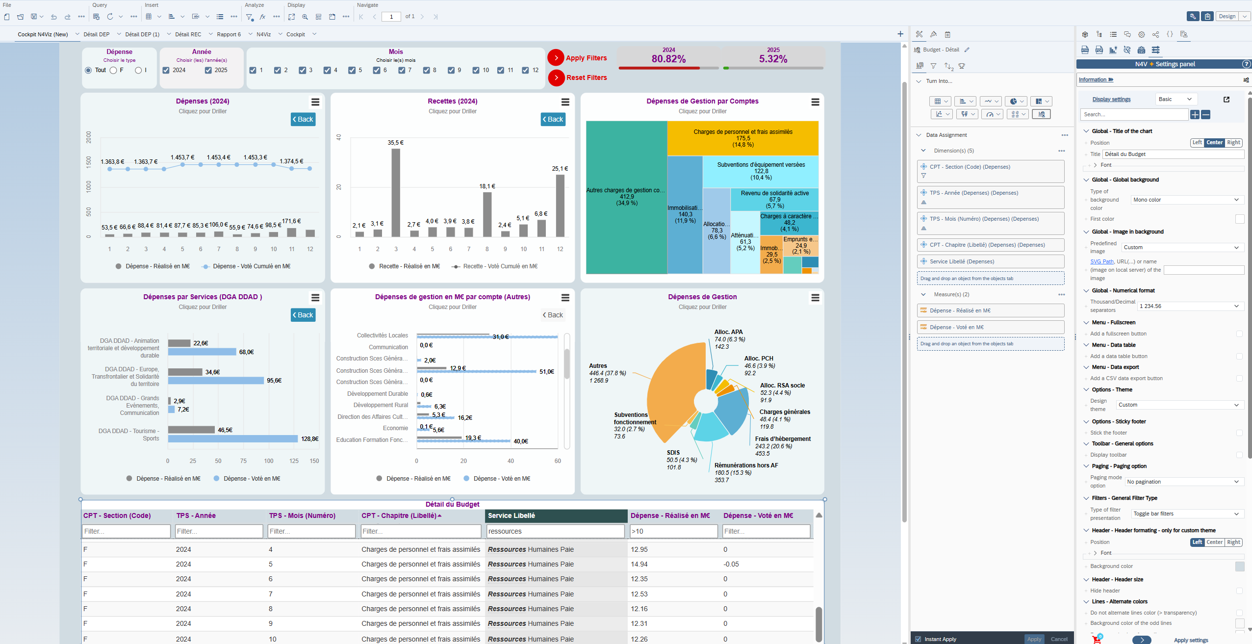
The MultiDrill combines several chart types on the same screen with synchronized filters and drill-down — one of the most powerful N4V FOR WEBI widgets for analytical dashboards.
N4V MultiDrill · need4viz.com
Advanced Tables — DataViz & Data Together
A dashboard without a table is an incomplete DataViz. N4V FOR WEBI offers advanced HTML5 tables with integrated filters, dynamic sorting, and conditional formatting — directly inside SAP WebI, no export needed.
N4V Advanced Table (dynamic filters) · need4viz.com
Planning — Gantt
The N4V Gantt integrates resource management directly inside WebI — no external tool required. Ideal for project teams already managing their data in SAP BO.
N4V Gantt (Resource Management) · need4viz.com
Geographic Maps — Web Maplines & Google Maps
N4V Maps integrates a full GIS into WebI. Web Maplines display geographic data on web vector map backgrounds, with drill-down and interactive popups. Google Maps adds the satellite/street dimension with latitude/longitude geocoding or density heatmaps.
N4V Web Maplines · need4viz.com
N4V Google Maps · need4viz.com
These examples represent only a fraction of the N4V FOR WEBI catalog — more than 60 interactive widgets available.
—
5. Report Distribution & Accessibility
Distribution Channels
A report, however well designed, only has value if it reaches the right people at the right time and in the right format.
Digital Accessibility: A Legal Requirement
The WCAG 2.1 standard sets the international accessibility baseline for the web. In the European Union, the Web Accessibility Directive (2016/2102) and the European Accessibility Act (2019/882 — applicable from June 2025) impose growing obligations on public bodies and large enterprises. In the United States, Section 508 of the Rehabilitation Act requires federal agencies and their contractors to meet WCAG 2.0 AA, while the ADA increasingly applies to web-based reporting tools used by the public.
—
6. Open Data Sources to Leverage
Open data has become a strategic asset for BI professionals. Here are the leading free and freely reusable sources, ready to use directly in your SAP WebI reports.
European Open Data Sources
United States & International Sources
—
7. DataViz and Artificial Intelligence: The Next Revolution
AI is profoundly transforming DataViz — not just in how data is presented, but in how it is generated, queried, and interpreted. Three major trends are emerging.
Natural Language as the Query Interface
More and more tools allow users to ask questions in plain language — “What are my sales by region for last quarter?” — and automatically get the query, the data table, and the recommended chart. Users no longer need to master SQL, BI universes, or technical filters.
Intelligent Chart Recommendation
AI analyzes the structure and semantics of selected data to recommend the most appropriate chart type. The engine guides toward the optimal representation based on the detected analytical objective — comparison, trend, correlation, or distribution.
Forecasting and Time-Series Analysis
Modern tools embed forecasting algorithms that automatically detect trends, seasonality, and anomalies in historical data — with confidence intervals and “what-if” simulations.
Key security principle: only universe metadata is sent to the AI engine — never actual business data — ensuring full compliance with enterprise governance requirements.
—
8. N4V FOR WEBI: DataViz inside SAP BusinessObjects
If your organization relies on SAP BusinessObjects Web Intelligence, you already have a powerful reporting platform. But WebI’s native DataViz capabilities have structural limitations: basic charts, limited interactivity, and distribution constrained by SAP BO licenses.
N4V FOR WEBI fills these gaps without replacing your existing infrastructure — no migration, no code, no additional licenses for your readers.
→ Discover all N4V FOR WEBI pillars on need4viz.com
—
👉 Discover Need4Viz and What We Bring to SAP Web Intelligence
Need4Viz extends SAP Web Intelligence with advanced DataViz, interactivity, automation, and AI capabilities to transform your reports into genuine decision-making tools.
👉 Discover Need4Viz and what we really bring to SAP Web Intelligence
Need4Viz extends SAP Web Intelligence with advanced dataviz, interactivity, automation and AI capabilities to transform your reports into real decision-making tools.
Discover Need4Viz